Materra
Client
Materra
Category
Hotel
Type of Work
Branding, Motion
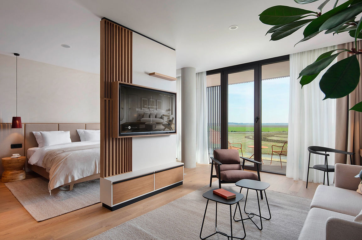
Knockingham crafted the Materra brand for a unique wellness and wholeness hotel set in the serene expanse of a rural landscape. The name Materra, derived from “Mater” (mother in Croatian) and “Terra” (Latin for soil), reflects a nurturing haven rooted in nature’s restorative power. This countryside retreat offers a diverse range of wellness activities inspired by Eastern traditions, designed to foster self-awareness, resilience, and rejuvenation.
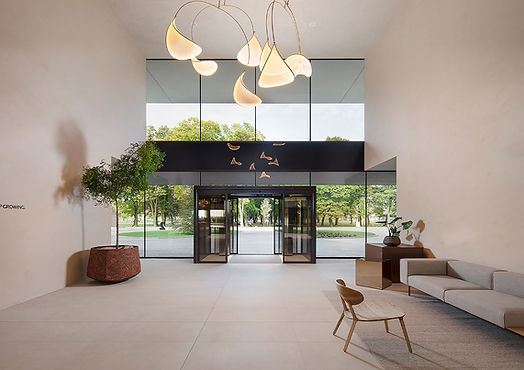
Our branding approach highlights minimalism and balance, ensuring the visual identity seamlessly integrates with the hotel’s natural surroundings, architectural design, and interiors. By avoiding sensory overload, we created a brand that embodies tranquility and harmony, mirroring Materra’s essence as a sanctuary for holistic well-being.

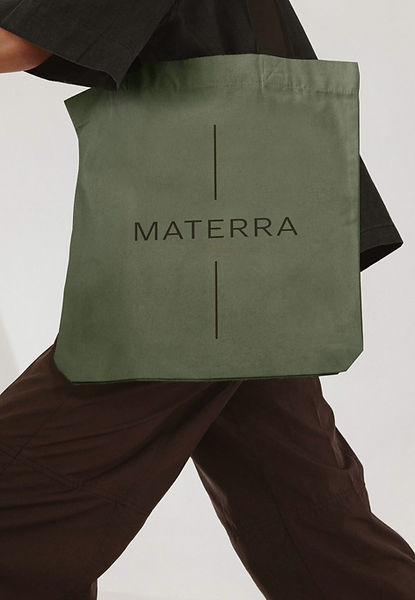
The logo’s vertical lines symbolize grounding and stability, reflecting the “Back to the roots” slogan and encouraging guests to reconnect with nature and themselves.


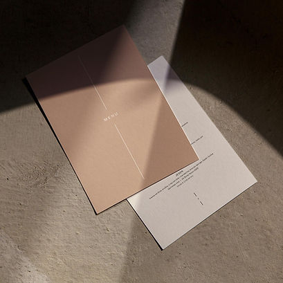
Brand colors are inspired by earth tones to achieve a calming and natural effect, subtly communicating the brand’s essence.


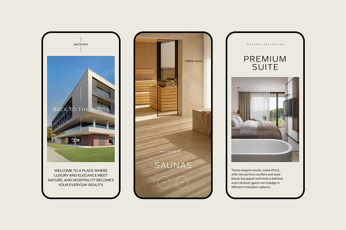


The website and TV navigation interfaces are crafted for functionality, with a design that’s aesthetically subtle and non-intrusive.

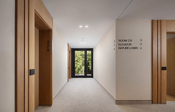
A minimalist wayfinding system employs straightforward illustrations for easy navigation and a smooth guest experience.


Motion design, audio branding, and all merchandise feature a seamless and soothing style that captures the hotel’s peaceful and rejuvenating atmosphere.